How Effective Is The Combination Of Your Main Media Product And Ancillary Tasks?


How I Sourced The Images For My Ancillaries

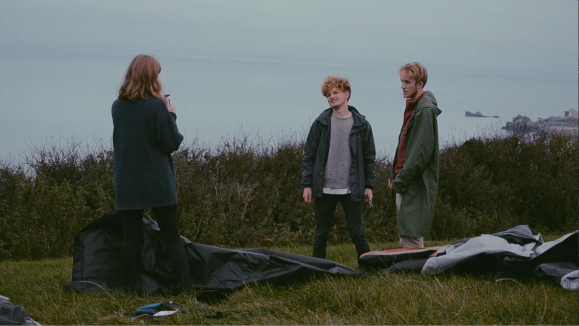
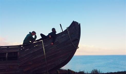
All throughout the filming process, I took candid photos of the three cast members, as their off-screen relationship was very similar to that of their on-screen characters. I wanted the photos to match the subtle attitude of the film,rather than having a conventional, striking poster. This is because it would mean that the products don't fit the same style/genre; resulting in an unsuccessful combination of tasks.
What Technology Did I Use?
For the film poster and magazine review, I used my pre-existing knowledge of photoshop and lightroom. I filtered the images to make them look more colourful and appealing. Then I used the shape and text tools in photoshop in order to manipulate the images in a way that resembles a film poster and magazine. One problem I had here was that there were too many layers on the magazine artcile, meaning that it was extremely difficult to order and overlap layers, so the creation process took an unnecessarily long time to do.
Screenshots Of The Editing Process


More Screenshots


Researching Other Products

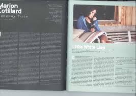
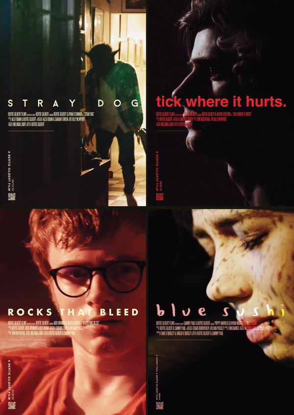
Before I started creating my ancillaries, I started looking at film posters and magazine spreads within the indie drama genre. Specifically at 'Little White Lies' magazine and film posters for Bertie Gilbert films. This was a valuable process as it inspired my creativity in a way which aligns with my main product.
How My Ancillaries Challenged Normal Codes And Conventions Of Film Posters Magazines

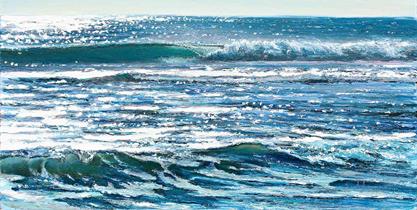
The main way I challenged normal conventions is through using two separate images for my film poster.I wanted to do this because it would hint at the plot effectively. The top image shows a warm bright atmosphere, and the bottom image shows a darker, more stressed mood. I felt that the combination of this, plus the visually appealing scenery would attract an audience successfully.

My magazine article also challenges some codes and conventions as it is a lot less busy and vibrant than reviews found in magazines such as Empire. However, my double page spread follows all the codes and conventions of an independent magazine such as Little White Lies.
Use Of Font

One key feature which tied all three of my products together was the font I used. I had to email a company in order to attain access to 'Vtks Solaris' - the reason I wanted to use it was because the hand-written style matches the genre and style of the theme. I believe it is successful in all of its uses as it each piece of mine would be ruined by a font which is too bold.


Conclusion


In summaration, I believe that by carrying out research and by using my knowledge of photoshop, lightroom and fonts, I have created a relatively successful combination of my main media product and ancillary products.