digipak
daniel-odebode1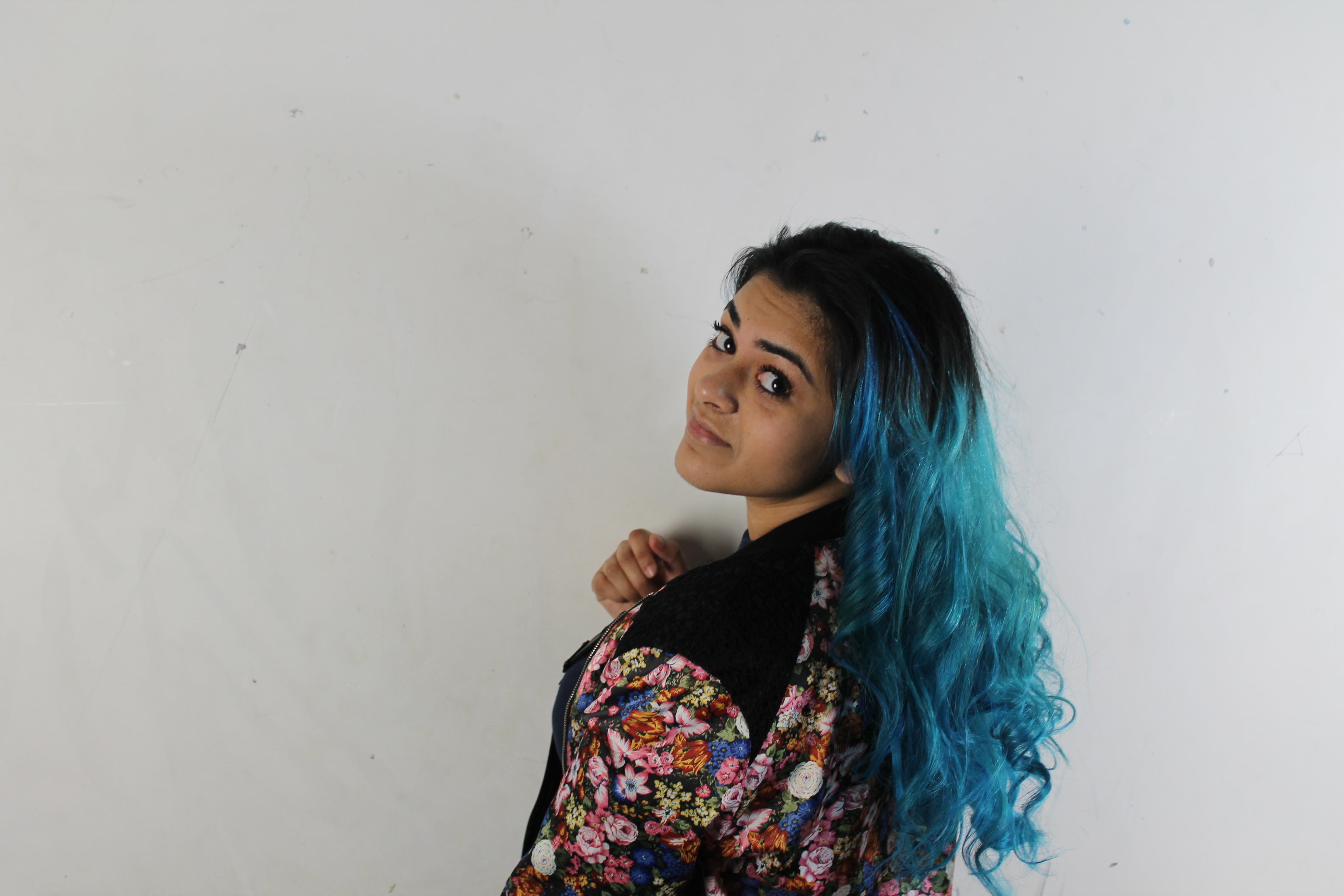

digipak progression
pkaur blue
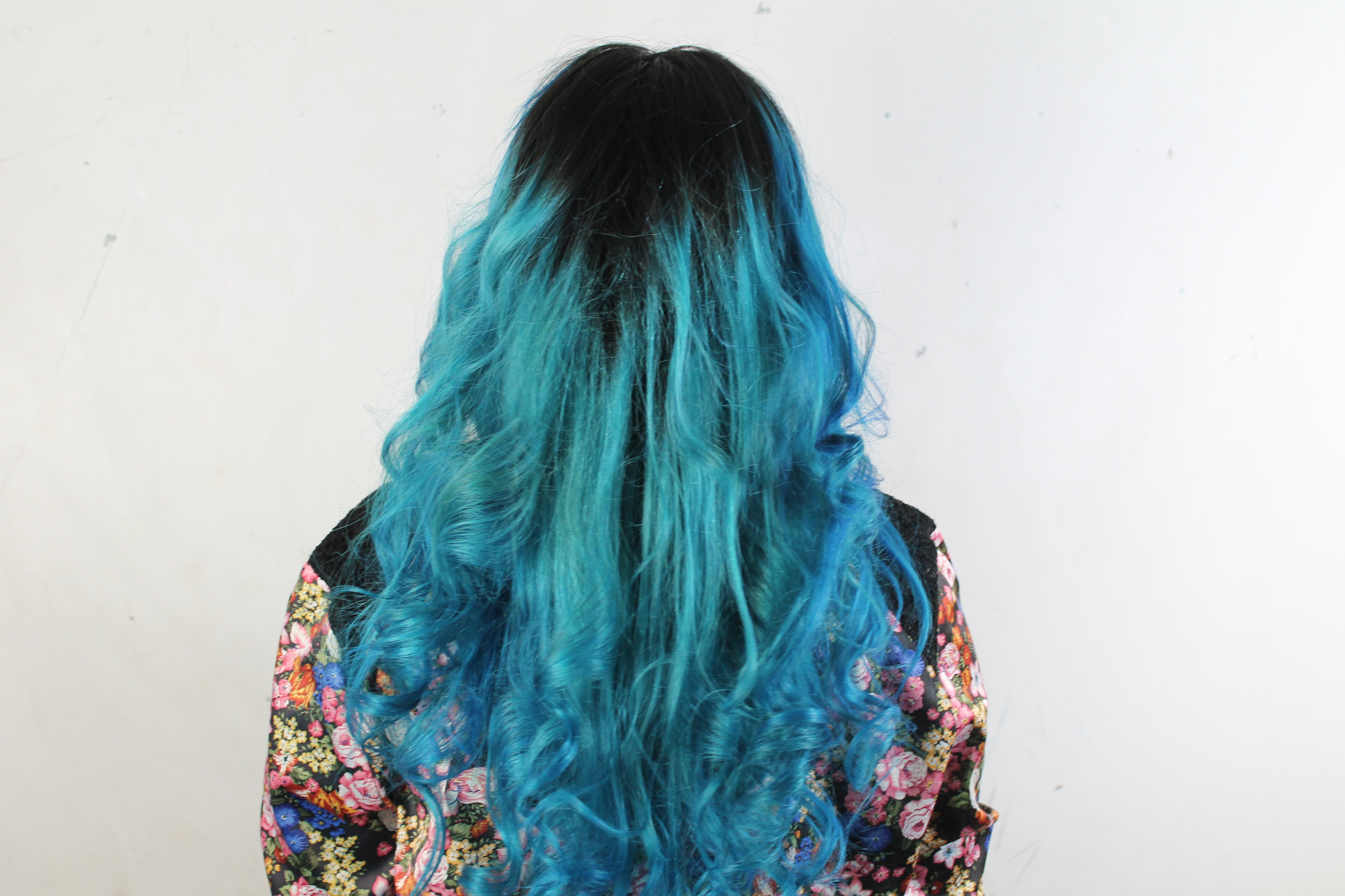
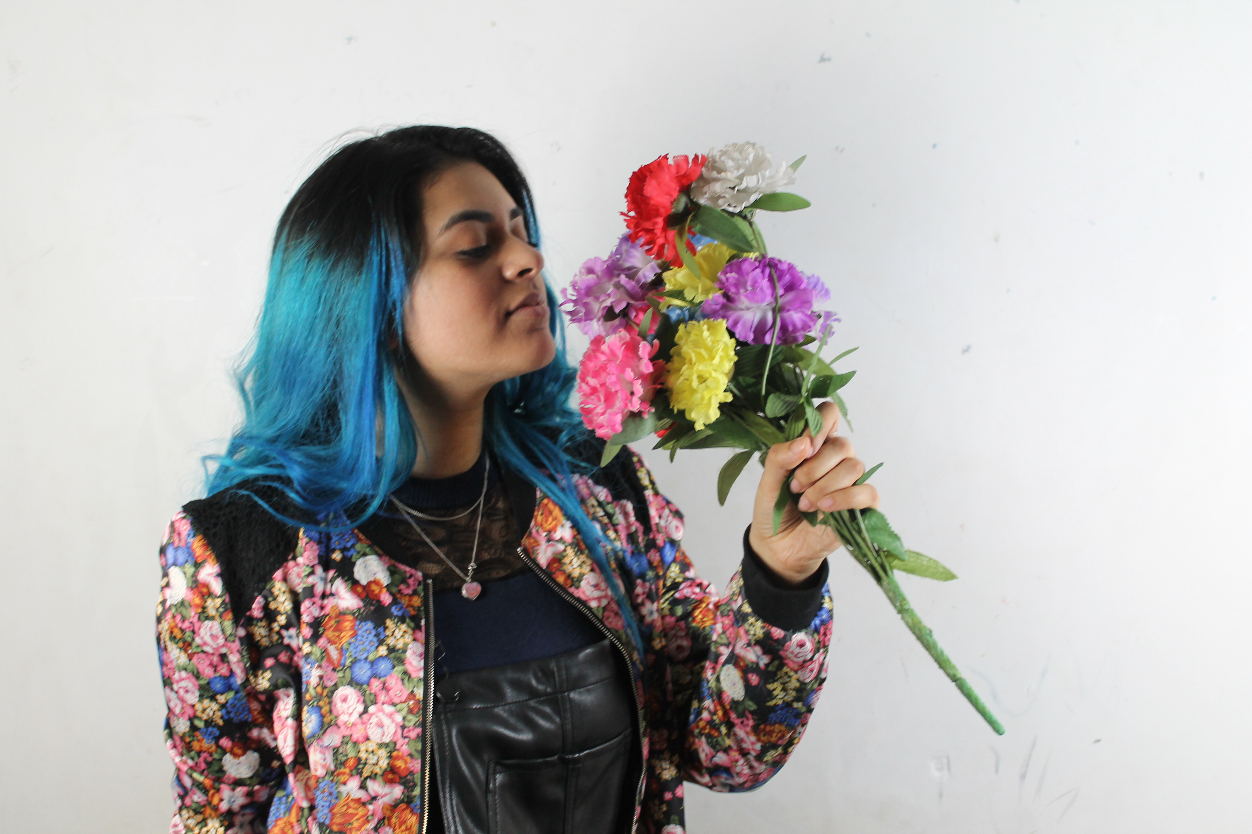
for our digipak cover we decided that we would have to do a photo shoot with our artist pkaur blue so we went into the photography studio and took photos
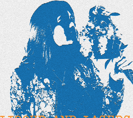
once i had been through all the photos i picked the photo i thought i could work with best in photo shop and also the one i thought looked the most artistic which was the one above

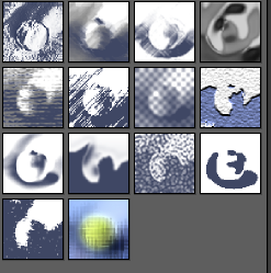
once i had chosen the photo i wanted to use i put them into photoshop and played around with textures in order to distort my image to change and give the cover an artistic feel to it.

once played around with the textures i finally found one that suited the original picture and went ahead to use for my digipak cover. i decided to use note paper


after deciding what texture to use for my digipak i decided to then select the font i was going to use which was travelling typewriter because it looked good with the colour i selected

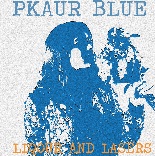
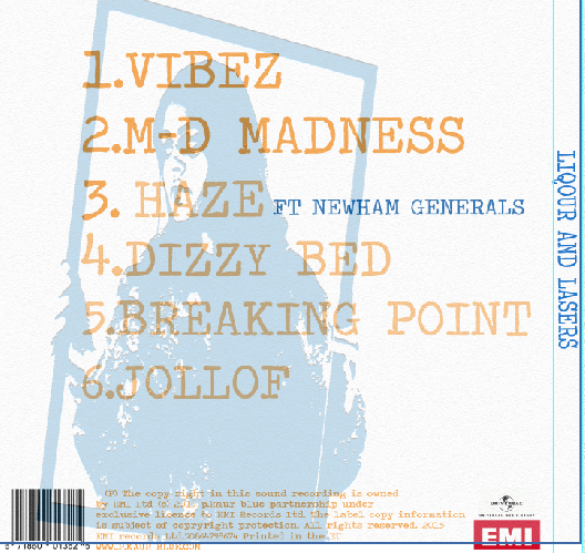
once i had added the texture and the font the final outcome of my digipak was this. All i needed to do was add the copyright,label and barcode onto the front and back of my digipak. for the colour of the font i decide to keep the blue theme as part of our artists image but i also decide to use the orange colour as a contrasts between the 2 colours