EVALUATION QUESTION 1 - MUSIC VIDEO
shadowhunterjosh75


In what ways does your media product use, develop or challenge forms and conventions of real media texts?
emaze created by Josh Pamfilo
Firstly, the media products I have developed in A2 were a music video followed by a promotional package (ancillary products). They were an album cover followed by a back, insert and gatefold, as well as a magazine advert. Inspired by other existing indie music videos such as the likes of Sundara Karma's "A Young Understanding" and "Vivienne", the music video for Lymington's original song, "Vodka and Cherryade", was mainly based around band performance and narrative. This is typically expected in products of the same genre. However, as I learned from my audience feedback, I decided to give my original product a twist by combining live-action with stop-motion performance with LEGO minifigures.
Foreword
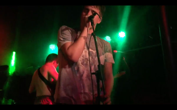
Screen shot taken from "Vodka and Cherryade", depicting the band name superimposed on top of a cutaway. This can be compared to a convention used in the Hunna's music video for "Bonfire" - see above
What conventions were identified?
For the album cover and its supporting ancillary products, there are several conventions of real-life music magazine posters and albums that were used to make them professional. A cherry motif was used to create a sense of branding for Lymington (it related to the song title "Vodka and CHERRYADE". This enables audience to go and look out for their iconic logo in their products.
Lymington's masthead is stylised in a professional, grunge way to capture an indie feel. This font is kept the same throughout their ancillary products in order to keep their sense of brand image - to make their target audience aware of who they are. Using Adobe Photoshop CC, I added drop shadow to establish a sophisticated style of album cover in order to make it as professional as possible.
The album cover makes use of a highly lit shot of the band members themselves as to establish their identities and make them stand out to audiences. Furthermore, the blue colour scheme anchors the band image as well.*

Album front cover, featuring all six band members. It is simplistic. The album title references the title track, that of which is used in my music video. Font is bold and white. Drop shadow is utilised to make the masthead stand out.
*By culminating these visual aspects, the album cover is created. Richard Dyer's star theory can be applied to this - the artist's brand identity benefits the institution as sales are increased by them becoming a household name. They must be recognised by a certain aspect which may be metonymic of their nature.
Back
cover
For the back cover, I adopted the approach of using spines on each side to conform to the norms of a typical album back cover. Each spine adopts the same blue colour scheme as the front cover, and the font is kept the same to maintain brand image, along with resized cherries to anchor promotion. Record label is evident as shown in both spines and at the bottom (End of the Trail Records and Rough Trade). This references the band's indie aesthetic as both record labels are indie-based. Besides that, the bar code in the right proves that I have adopted professional codes and conventions of a back cover. Not only that, but website links below it. The tracklisting is centred and boldly coloured so it is recognisable to the audience, who will know what songs are included in the album.

At the bottom left is the production number, another convention associated with back covers. Copyright and year of production was included to make it look as professional as possible, along with who owns the copyrighted material, all rights reserved. This blurb also mentions it is "made in the EU" as all European region albums have this on their back covers.
Inner cover and gatefold
When one examines the inner artwork of the CD, they would expect to see the artist at the back. It works as a semiotic, helping to promote their band image better as they are represented as a collective. However, their brand identity will be the most prominent feature here as both inner cover and gatefold each contain a cherry motif - one disguised as graffiti on the pink wall and the other one but in 3D. The latter helps for a psychedelic perspective, which is uncommon in indie music products. This proves that I have appropriated a sense of branding for Lymington so audiences will know who they are.
What conventions were adopted?
Bordwell and Thompson, two film critics, state that anchorage is present everywhere, and I have appropriated this with the recurring cherry motif, the same font for their masthead, and blue colour scheme. As Daniel Chandler would suggest, these cherry symbols would be known as 'visual signs' that the target demographic would look out for, which helps to gain a cult following and promote Lymington.

Music magazine
promotional advert
For my magazine promo advert, I appropriated many codes and conventions of ordinary music magazine adverts normally found in the likes of NME and Rock Sound. Brand identity is blatantly obvious yet a little subtle as the cherry blends in as 'graffiti' on top of a building (editing out the bhs sign using Photoshop). Band name and album title have both maintained the same grunge font to anchor branding across the album and its accompanying advert.
I adopted many iconic codes and conventions: an NME Magazine review below the masthead; the release date; songs that will be included in the album; and media outlets, along with their website url. Twinned with an excellent image of the main band members walking towards the audience, this poster was fit for selling the band along with their album simultaneously.
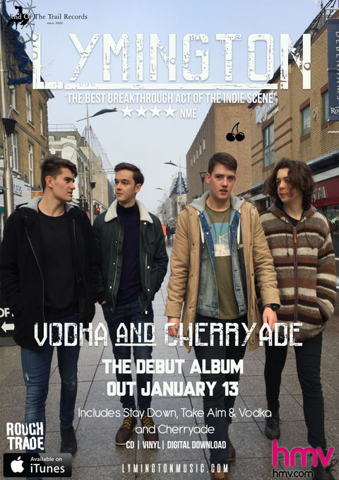

However, I used a different photograph rather than the same album artwork for Vodka and Cherryade so challenging expected conventions of a music magazine poster. Seeing the band members walking forwards is considered a direct address to their audience - they will be recognised easily, fulfilling Dyer's star theory.
hmv and iTunes were added as media outlets that are able to sell this record. That way, the advert would look genuinely professional. Henry Jenkins would say that the cherry motif and direct address would appeal to Lymington's 'fandom'.
Here is another music magazine advert promoting the Stone Roses' live tour dates. However, this is different from a normal promo advert as it advertises their live gig dates rather than an album or single. In opposition, I adopted a bold font just like this advert appropriates it. It is easily noticeable, and would appeal to the young target demographic.
Music video - what conventions are included?
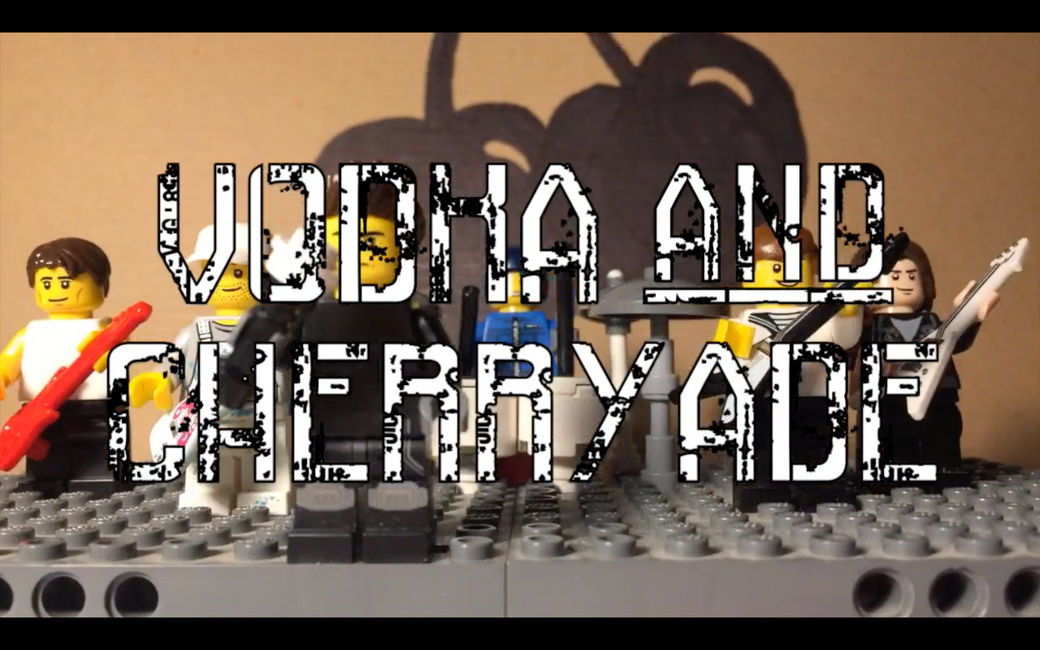
Brand image is clearly there - cherries forming a heart throughout various cutaways AS WELL AS a hand-drawn cherry in the background of LEGO stop-motion wide performance shots. Avid fans would hunt for this motif throughout shots. Also in the intro the name drop and song title superimposed on top of cutaways are both directly lifted from indie music videos appropriating these conventions such as the Hunna's "Bonfire" and Sundara Karma's "Vivienne", not to mention Blaenavon's "Let's Pray".
OTHER CONVENTIONS
A blend of live-action and stop-motion animation was appropriated to establish a unique twist for indie music videos. This appeals to teenage audiences, especially when this combination promotes creativity.
Performance shots were included since they adhere to the codes and conventions of indie music videos.
Some clips are cut in time with the guitar rhythm, i.e. before the chorus the video cuts to different shots, signifying how fast-paced it is. The narrative focuses upon a teenage male and female spending time together, partially conforming to the hegemonic expectation of 'boy meets girl' in a narrative. However, I challenged this convention by not heavily featuring them too much in the music video.
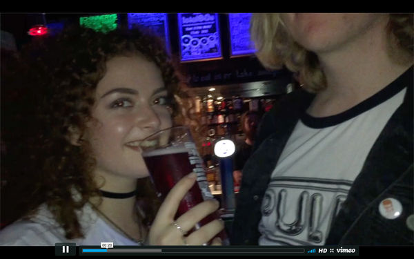

First shot: Lucia drinks an alcoholic beverage, reflecting the lyric "With a glass of vodka and cherryade", though actual vodka wasn't displayed so not to offend younger viewers.
Second shot: lip syncing as a convention. Mid-shot of Freddy singing the song - a typical convention in indie music videos.
Third shot: different environment, same person lip syncing.
to detect in "Vodka and Cherryade"
Fisheye lens are a rare form of convention to be used in music videos, which is why I adopted that approach for some shots in my music video. It provides a psychedelic perspective from the point-of-view of the viewer, making audiences uneasy but as well participating in the video themselves, much like a 'participatory culture' (Henry Jenkins terms this).
Each Lymington band member dresses casually in each cutaway. Normally this would involve leather jackets in other indie music videos. However, I challenged this expectation by filming on different days so as to show variety between different shots during the music video. In this case, it still conforms to indie rock codes and conventions.
Conventions
A primary staple of indie rock music videos is band performance. Close-ups of guitars and the vocalist singing are generally typical of the genre; audiences expect to see these aspects in these types of music videos. Live instruments are glimpsed in a few cutaways, conforming to indie music.
Different shots are included as well as a variety of locations in the "Vodka and Cherryade" music video, providing the audience with a wide diversity of environments to immerse themselves in while watching. They can IDENTIFY themselves with the artist as the latter fall in the same age group as their target audience.
At the very end, a copyright blurb is shown. This is to establish who owns the music video and what record label the artist is signed to (End of the Trail Records - loosely connected to indie bands such as Blush and Coquin Migale).
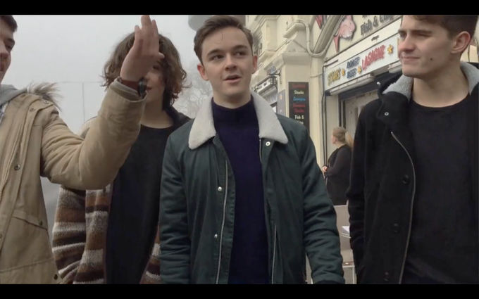
Here is a screen shot of Lymington's band members walking towards the audience. This is direct address to the audience. Richard Dyer would suggest that this relates to fandom - the band is a collective approaching the audience as if they want to be recognised, which they may well be.